In “Classical Liberalism versus Anarchocapitalism” (originally published in Property, Freedom and Society: Essays in Honor of Hans-Hermann Hoppe (2009)), Jesus Huerta de Soto provides an excellent chart (above) that I think is superior to the Nolan Chart (below).

See also Tom Knapp’s political spectrum bell curve: “On the far Left (market anarchism) and the far Right (anarcho-capitalism), appetite for political government trails off to zero (which is why “Left” and “Right” libertarians have so much in common).”

Tom Knapp’s Political Spectrum Bell Curve
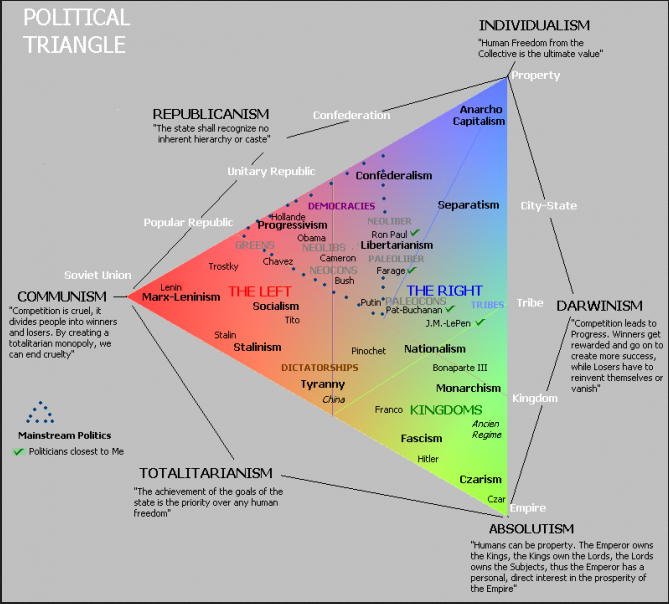
Update: See also the Political Triangle (from Twitter):